Art Education · 8 min read · Kuriosis Studio Team, Berlin · July 2026
The exhibition poster is one of the few art objects that started life on the street and ended up on the museum wall. What began in 1890s Paris as advertising — printed to fill hoardings and sell theatre tickets — became a design language museums adopted, refined, and now sell in their own shops. This guide traces how the exhibition poster grew from commercial lithograph to collectible format, what separates a good one from a titled reproduction, and why a single well-chosen poster still anchors a wall better than almost anything else.
Where the Poster Came From: 1890s Paris
The modern poster has a reasonably precise origin. The French painter Jules Chéret (1836–1932) spent the 1860s learning colour lithography in London, then opened a printing firm in Paris and began producing large, brightly coloured posters that treated the street as a gallery. He is widely credited as the father of the modern poster, and over his career he produced more than a thousand of them. Critics described the walls he filled as a museum in the open air — a phrase that captures exactly what the format would become.
What made this possible was a printing technique. Colour lithography — printing from a series of stones or plates, one colour at a time, to build a full-colour image — had fallen out of favour among serious artists by mid-century. Chéret revived it so completely that the decades around 1900 are sometimes called a colour revolution in print. For the first time, large, richly coloured images could be produced quickly and cheaply enough to cover a city, and the results were good enough to be worth keeping. The poster arrived as both a mass medium and an art object at exactly the same moment.
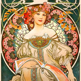
Two artists turned Chéret's commercial craft into something collectors chased. Henri de Toulouse-Lautrec made his first poster, Moulin Rouge, La Goulue, in 1891; it was so large it had to be printed on three separate sheets, and its flat colour and daring composition are usually cited as the moment the poster became fine art. The Museum of Modern Art, which holds the print and more than two hundred of his other works, treats his posters as central to late-nineteenth-century printmaking. Then came Alphonse Mucha, whose Gismonda — designed for Sarah Bernhardt and posted across Paris on New Year's Day 1895 — was nearly life-size at 216 centimetres tall. It set off a wave of poster-collecting the era named affichomania, vivid enough that, as the Mucha Foundation records, collectors bribed bill-stickers and cut posters down from the hoardings at night to own them. The exhibition poster is its direct descendant.
From the Street to the Museum Wall
What moved the poster indoors was, in part, a change in how it was designed. The Bauhaus — the German design school founded in 1919 — replaced decorative Art Nouveau ornament with geometry, primary colour, and clean sans-serif type. Its 1923 Weimar exhibition and the typographic work of Herbert Bayer reframed the poster as a way to organise information rather than depict a subject. Three decades later the Swiss International Typographic Style, developed in Basel and Zürich in the 1950s, gave the format its mature grammar: a featured artwork, a typographic hierarchy, the institution's name, and the exhibition dates, all held together by a grid.
Museums had a practical reason to embrace the format. The Museum of Modern Art and its peers turned the exhibition poster into the museum shop's signature object, built on a simple idea: not everyone can own the painting, but for the price of a print anyone can own the image at the centre of the show. It is among the most democratic things a museum makes, carrying the authority of the institution while asking almost nothing in return.
That grammar is what museums standardised. In a good exhibition poster the artwork and the typography are designed together rather than dropped behind a title bar, so that Klimt's Attersee or a Van Gogh night scene reads as a single, considered object. The museum shop turned this into the most democratic idea in the art world: for the price of a print, you could own the image at the centre of the show. Our own Bauhaus Ausstellung 1923 poster follows the same logic the school set down a century ago.
 Attersee by Gustav Klimt
 Café Terrace at Night by Van Gogh
 The Pink Cloud by Henri Edmond Cross
What Drives Collector Value
Original vintage posters are a serious market. A well-preserved Chéret or Lautrec can reach five or six figures at auction — an original of the three-sheet Moulin Rouge sold for $241,500 in New York in 1999, a record at the time, and more than half a million dollars at Christie's in 2014 — while condition alone can swing a single Lautrec from a few hundred euros to tens of thousands. If you are looking at originals, four factors decide the price. If you are looking at reproductions, the same four explain why the images are worth living with even when the originals are museum pieces.
Artist and Name
A recognised name carries a poster the way it carries any artwork. Lautrec, Mucha, Klimt, and the Bauhaus masters command a premium because the image already lives in the culture.
Condition
Posters were printed to be used and thrown away, so survivors in clean, unfaded condition are rare. Among originals, condition is often the single largest price factor.
Rarity and Edition
Short print runs and images that were widely posted but rarely saved drive scarcity. A famous design with few surviving copies is what auction records are made of.
Printing Method
An original stone lithograph is a different object from a later reproduction. Method sets the ceiling on an original's value — and defines the quality of a good modern print.
"The posters immediately became objects of desire to collectors, many of whom used clandestine methods to obtain them, either bribing bill stickers or simply going out at night and cutting them down from the hoardings."
— Mucha Foundation, on the reception of Mucha's posters
Browse Exhibition Prints at Kuriosis →
Living With an Exhibition Poster
This is where the reproduction earns its place. An original vintage poster is a scarce, expensive object that lives behind glass in a climate-controlled room; the image on it does not have to be. A well-made modern print puts the same composition on your wall at a size you actually have space for, printed on a stable, archival surface rather than fragile hundred-year-old paper. What you take home is the picture itself — the part you actually live with — at a scale and a price that fit an ordinary wall.
Exhibition posters are built for scale. The typography needs room to breathe and the featured image is meant to read from across the room, which is why they work best at larger sizes and as a single statement rather than one piece in a crowded arrangement. A poster above a desk, a sofa, or a dining table does the work of a whole gallery wall on its own.
There is also a quieter reason the format works so well at home. A framed exhibition poster carries a small signal — it says you have looked at art, that you care about it, that you chose this image on purpose. It is the difference between decoration and a stated preference. That is why a single strong poster over a sofa often does more for a room than a wall of smaller, safer pictures: it reads as a decision rather than a gap-filler.
The frame matters more here than in most categories, because the format itself references the museum. A black frame gives you the clean institutional look; oak warms it up for a living room; walnut brown suits vintage Bauhaus and Art Nouveau pieces. A quiet botanical study like Kazumasa Ogata's Japanese Azaleas asks for a different setting than a loud graphic poster — softer light, a calmer wall — while a Klimt landscape can carry a room by itself. The point of the format is confidence: one considered image, well framed, saying you have chosen it deliberately.
More exhibition prints from our collection:
 Japanese Azaleas by Kazumasa
 Morning on the Seine by Monet
 Hygieia by Gustav Klimt
Why Fine Art Prints? The Kuriosis Approach
Our exhibition prints pair works of art with clean typography in the museum tradition, laid out and printed to order in our own Berlin studio on archival pigment inks rated for a hundred years and more. The result carries the authority of an institutional piece without the gallery-shop markup.
Sources & Further Reading
- Encyclopædia Britannica — Jules Chéret, father of the modern poster
- MoMA — Toulouse-Lautrec, Moulin Rouge: La Goulue (1891)
- Mucha Foundation — Gismonda (1894) and the poster craze
- MoMA — Herbert Bayer and the 1923 Bauhaus exhibition
- Poster House — The Swiss Grid and the International Typographic Style