Abstract art that works on a wall — not because it matches a colour scheme, but because it holds attention. Geometric compositions, colour field studies, and contemporary abstraction from artists who treat form and colour as subjects in themselves.
This collection spans the full range of contemporary abstraction — from hard-edged geometric work to soft, atmospheric colour fields. What ties it together is intent: every piece here uses form, colour, and composition as its primary subject matter rather than representing something external.
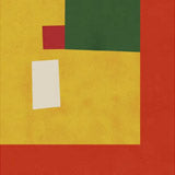
The Bauhaus-influenced geometric compositions by Ana Rut Bre sit alongside the layered, painterly abstractions of Dorothy Fagan. Jay Stanley's geometric expressions use bold colour and precise form. Treechild brings organic, nature-derived shapes into abstract territory. The range is deliberate — abstract art is not one thing, and this collection reflects that.
The advantage of abstract prints for interior use is straightforward: they don't compete with the rest of a room's visual content. A landscape or portrait brings its own narrative. An abstract work brings colour, rhythm, and visual texture without imposing a subject — which is why abstract prints are among the most versatile pieces for living spaces, offices, and commercial interiors.
Choosing the Right Format
Fine art paper suits the geometric, hard-edged compositions — clean lines and flat colour fields read best on a smooth matte surface with full tonal accuracy. Paper prints are available in A3, 50×70cm, 70×100cm, and A0, with oak, black, or walnut brown frames.
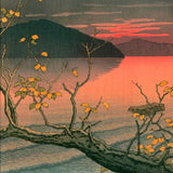
Canvas is the better choice for the painterly, textured abstractions — colour field work and atmospheric compositions gain depth and warmth from the canvas surface. Canvas prints come in 30×40cm, 50×70cm, and 70×100cm, with an optional floating frame.
Abstract work benefits from scale. A 70×100cm or A0 print gives a composition room to develop its visual rhythm. Smaller formats work for tighter, more geometric pieces where the impact is concentrated rather than expansive.
Pairing Abstract Prints
Abstract prints pair naturally with almost anything — that is part of their function. A geometric abstract alongside a botanical print creates contrast between organic and structured form. An atmospheric colour field next to a landscape creates visual harmony through shared palette.
For a dedicated abstract wall, mix geometric and painterly pieces in matching frames — the stylistic variation within the abstract register keeps the arrangement dynamic. Work from our Bauhaus collection and Wassily Kandinsky prints provide art-historical depth to a contemporary abstract grouping.
All prints are produced in our Berlin studio using archival pigment inks rated for 100+ years.
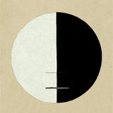
The Swedish painter who produced fully abstract work in 1906, left instructions to hide her most important series for twenty years after her death, and became the most-visited exhibition in...


 Metal Brushs nº1 by AlmaFrom CHF 25.00 /
 The cattle on the mountain by Georges ValmierFrom CHF 23.00 /
 Dream Sea by Dan HobdayFrom CHF 25.00 /
 Bauhaus Geometric Design Retro by RetrodromeFrom CHF 25.00 /
 Silhouettes and Symbols by TreechildFrom CHF 25.00 /
 Azure Whispers by Maira RibenaFrom CHF 25.00 /
 Wassily Chair Marcel Breuer by Rosi FeistFrom CHF 25.00 /
 Reach 4 by Jazzberry BlueFrom CHF 25.00 /
 Algue blanche sur fond rouge et vert by Henri MatisseFrom CHF 23.00 /
 Triangular Redwood by Emel TunaboyluFrom CHF 25.00 /
 Yellow Vase and Purple Mat by Little DeanFrom CHF 25.00 /
 Geometric Echoes by THE MIUUS STUDIOFrom CHF 25.00 /
 Lilacandthelady by Kristin BrinFrom CHF 25.00 /
 Green Echoes by THE MIUUS STUDIOFrom CHF 25.00 /
 Modern Abstract Art 65 by ThingDesignFrom CHF 25.00 /
 Geometric Harmony by Emel TunaboyluFrom CHF 25.00 /
 The lagoon by Henri MatisseFrom CHF 23.00 /
 Mask by Maja TomljanovicFrom CHF 25.00 /
 Museum of Modern Art New York by AnnickFrom CHF 25.00 /
 Entropy 1 by Jazzberry BlueFrom CHF 25.00 /
 Kaufmann Desert House by Rosi FeistFrom CHF 25.00 /
 Hexagon Vase In Green by Little DeanFrom CHF 25.00 /
 flowers by Pascal MarlinFrom CHF 25.00 /
 The Woman With the Swirls by Bea MüllerFrom CHF 25.00 /
 Japanese Birch Trees by NicholasFrom CHF 25.00 /
 Sunlit Wilderness by NicholasFrom CHF 25.00 /
 Energetic bold composition by Little DeanFrom CHF 25.00 /
 Silhouette Branches by TreechildFrom CHF 25.00 /
 Henri Matissse Set #5 by jay stanleyFrom CHF 25.00 /
 DREAMSCAPE REVERIE by RS LAB STUDIOFrom CHF 25.00 /
 Bauhaus Ausstellung by RetrodromeFrom CHF 25.00 /
 Leafy Whispers by TreechildFrom CHF 25.00 /
 Flowing Contours by TreechildFrom CHF 25.00 /
 Nature Inspired Landscape by Little DeanFrom CHF 25.00 /
 Wildflower Blossom Landscape by NicholasFrom CHF 25.00 /
 Patternplayno.20 by TreechildFrom CHF 25.00 /
 Fluid Echoes by TreechildFrom CHF 25.00 /
 Dream Wood by Dan HobdayFrom CHF 25.00 /
 Geometric Shapes And Bold Colors by Kintsugi99From CHF 25.00 /
 Blossom Fusion by TreechildFrom CHF 25.00 /
 The Woman With the Orange Stripes by Bea MüllerFrom CHF 25.00 /
 Whimsical Blooms by TreechildFrom CHF 25.00 /
 Flamingo In Flight by NicholasFrom CHF 25.00 /
 Abstract Rolling Hills With Textured Gray Sky by Sannel LarsonFrom CHF 25.00 /
 Floating Fish Dream by NicholasFrom CHF 25.00 /
 Golden Divide by THE MIUUS STUDIOFrom CHF 25.00 /
 Funky Blouse by Bea MüllerFrom CHF 25.00 /
 In Balance by Ellen GreupFrom CHF 25.00 /