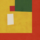
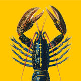
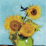
August's selection leans into high summer, warm colour, and a little nostalgia. Food and still-life work opens the edit, with Fresh Market Vegetables by Pauline Wegman, Spicy Red Peppers by Viktoriia Saunina, and Vibrant Wine Glass Bottle by Bo Anderson, alongside Le Sans Blague by Studio Mandariini and DApner Kebab Picnic by Natascha Baumgartner. Poolside and coastal scenes run through the middle: Floating Beach Ball by Daniel Coulmann, Surreal Pool Fun, Seaside View by Nicholas, and Peaceful Ocean Vista by Luisa Millicent. Warm illustrated portraits close the loop, with Ada Jarzebowska's Orange Tree Cafe and Morning Coffee Ritual, Essa Van Reis's Woman in Yellow Cape, and Pensive Woman Portrait by CATS AND DOTZ. Retro Jazz Club, Vibrant Jazz Ensemble, and Sparkling Disco Ball bring a music and nightlife thread into the mix. Browse our full range of Food & Drink prints and botanical posters if you want to extend any of these groupings.
Styling this selection
Most prints here are portrait format, suited to a narrow wall, above a sideboard, or a kitchen run. For a gallery wall, group by subject: the food and drink pieces — Fresh Bananas Net Bag, Red Apple, Orange Summer Spritz — sit naturally over a dining table or kitchen counter. The music and nightlife set — Retro Jazz Club, Vibrant Jazz Ensemble, Sparkling Disco Ball — makes a coherent trio for a living room or bar cart wall. If you'd rather a single hero, Golden Autumn Sunset or Peaceful Ocean Vista at 70×100cm anchors a room without companion prints. Because this is a monthly edit rather than a fixed category, the palette is tighter than a full subject collection, which makes mixing pieces from different subjects easier.
Match by colour temperature first. The warm citrus and kitchen pieces read well against white or pale plaster walls, while the cooler abstract work — Vibrant Abstract Layers, Soft Green Blue Circles, Serene Abstract Landscape — clusters better in minimal rooms. Three prints in the same format and a shared palette is usually enough for a balanced wall; there is no need to match subjects exactly. See our bestseller range for proven performers to hang alongside these picks.
Format and framing
All prints come on 225g matte fine art paper in A3, 50×70cm, 70×100cm, and A0. The graphic still-life and illustration pieces read well at 50×70cm or larger, where colour and line register; the photography-led work, like White Magnolia Bloom and Sparkling Disco Ball, works across every size. For framing, the warm citrus and kitchen prints pair naturally with Oak, the botanical and animal pieces suit Walnut Brown, and the graphic, high-contrast work reads cleaner in Black. All three frame colours are available from our Berlin studio. For more colour-led work, see our abstract prints.


 Butterfly Tropical Garden by MARYLENE MADOUFrom CHF 25.00 /
 Sparkling Disco Ball by Samantha HearnFrom CHF 25.00 /
 Retro Jazz Club by Patryk KrygowskiFrom CHF 25.00 /
 Seaside View by NicholasFrom CHF 25.00 /
 Friendly Leopard And Bird by Nikita JariwalaFrom CHF 25.00 /
 DApner Kebab Picnic by Natascha BaumgartnerFrom CHF 25.00 /
 Lemon Sun Lions Beach by Betty KlaasseFrom CHF 25.00 /
 Fresh Bananas Net Bag by NicholasFrom CHF 25.00 /
 Soft Green Blue Circles by Dina DankersFrom CHF 25.00 /
 Vibrant Jazz Ensemble by CATS AND DOTZFrom CHF 25.00 /
 Morning Coffee Ritual by Ada JarzebowskaFrom CHF 25.00 /
 Orange Summer Spritz by Jolly and DashFrom CHF 25.00 /
 Please Stay by Angelo CerantolaFrom CHF 25.00 /
 Dappled Light Leaves by Angelo CerantolaFrom CHF 25.00 /
 Vibrant Abstract Layers by ClaireFrom CHF 25.00 /
 Le Sans Blague by Studio MandariiniFrom CHF 25.00 /
 Red Apple by Rosi FeistFrom CHF 25.00 /
 Warm Houseplant Pot by Nikita JariwalaFrom CHF 25.00 /
 Speckled Bird Flight by Josephin HermsdorfFrom CHF 25.00 /
 Woman In Yellow Cape by Essa Van ReisFrom CHF 25.00 /
 Pensive Woman Portrait by CATS AND DOTZFrom CHF 25.00 /
 Vibrant Wine Glass Bottle by Bo AndersonFrom CHF 25.00 /
 Folk Art Horse Rider by Andreas MagnussonFrom CHF 25.00 /
 Orange Tree Cafe by Ada JarzebowskaFrom CHF 25.00 /
 Golden Autumn Sunset by Luisa MillicentFrom CHF 25.00 /
 Peaceful Ocean Vista by Luisa MillicentFrom CHF 25.00 /
 Floating Beach Ball by Daniel CoulmannFrom CHF 25.00 /
 Surreal Pool Fun by Natascha BaumgartnerFrom CHF 25.00 /
 Fresh Market Vegetables by Pauline WegmanFrom CHF 25.00 /
 Serene Abstract Landscape by Little DeanFrom CHF 25.00 /
 White Magnolia Bloom by Angelo CerantolaFrom CHF 25.00 /
 Spicy Red Peppers by ViktoriiaFrom CHF 25.00 /