The Tonal World of Corne Akkers
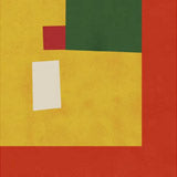
Corne Akkers is a Dutch artist whose figurative work draws on a broad range of influences — the geometric reduction of Cezanne, the atmospheric depth of Impressionism, and the psychological weight of Surrealism. His portraits and figure studies, including pieces like *Lorelei*, *Darja Collin*, and *Marlot*, are built on tonal rhythm rather than line: planes of different value shift and overlap to create form, depth, and a sense of movement within stillness. The palette tends toward warm neutrals — amber, ochre, soft grey — punctuated by stronger colour accents that draw the eye without disrupting the overall harmony. His *Neo Deco* series pushes the geometric element further, fragmenting figurative subjects into angular planes that reference Art Deco and early Cubism while remaining unmistakably contemporary. The *Homage to Eugene Durieu's Seated Female Nude* demonstrates his ability to reinterpret historical source material through a distinctly modern tonal vocabulary — the original reference is visible, but the treatment is entirely Akkers's own.
Paper, Canvas, and Framing
For the drier, more graphic pieces — the *Neo Deco* works and graphite-based compositions — fine art paper brings out every tonal gradation with clarity. A3 works for intimate portrait studies; 50x70 cm and 70x100 cm give larger figurative compositions the space they need to let the tonal planes read clearly. Paper sizes extend up to A0 for commanding, large-format presentations of his more complex multi-figure works. For the oil-based work, canvas is a natural match — the cotton texture reinforces the painterly quality, and pieces like the *Homage* series gain physical presence on canvas at 50x70 or 70x100 cm, where the material echoes the original medium. An optional floating frame adds a gallery-level shadow gap that gives canvas prints the presentation they deserve. Oak framing suits the warm neutrals of his palette; walnut brown adds depth to the earthier compositions; black frames work well with the more angular, geometric *Neo Deco* pieces where contrast and precision matter most.
Pairing with Other Artists
Akkers sits comfortably alongside other figurative and painterly artists in our contemporary collection. His tonal approach pairs well with more expressionist or abstract work — the contrast between his structured compositions and looser, more gestural pieces creates visual tension that holds a gallery wall together. For a European figurative art wall, combine with portrait or figure work from other Continental artists whose practice shares an interest in light, form, and the space between observation and interpretation. A single large Akkers canvas flanked by two smaller paper prints of his own work makes a strong, self-contained arrangement that shows the range between his graphic and painterly modes. All prints are produced in our Berlin studio using archival pigment inks rated for 100+ years.


 Neo Deco - 08-10-24 by Corné AkkersFrom CHF 25.00 /
 Lorelei - 12-07-18 by Corné AkkersFrom CHF 25.00 /
 Marlot - 04-04-21 by Corné AkkersFrom CHF 25.00 /
 Homage to Eugène Durieu’s Seated Female Nude by Corné AkkersFrom CHF 25.00 /
 Bergen - 10-04-20 by Corné AkkersFrom CHF 25.00 /
 Darja Collin - 22-09-22 by Corné AkkersFrom CHF 25.00 /
 Hatertse Vennen (Hatert Meres) 01 (2012) by Corné AkkersFrom CHF 25.00 /