What Characterises Julia Purinton's Work
Julia Purinton is an American contemporary artist whose work operates in the space between landscape and abstraction. The compositions suggest natural environments — horizons, fields, atmospheric depth — without depicting specific places. Instead, layered textures, muted colour palettes, and weathered surfaces create an impression of landscape as memory or feeling rather than documentation.
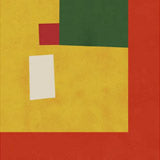
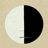
Pieces like Secret Garden and A Piece of My Heart use earthy, restrained tones — warm greys, dusty blues, soft ochres — applied in visible layers that give the surface a tactile, almost archaeological quality. The paint appears built up and scraped back, revealing traces of earlier colour beneath. Works like 14 and Untitled 2 push further into pure abstraction, where the landscape reference dissolves into texture and atmosphere alone.
What makes the work effective as wall art is the quiet complexity. From across a room, each piece reads as a calm, unified colour field. Up close, the layered surface reveals depth and movement — a quality that rewards sustained attention without demanding it.
Choosing the Right Format
Canvas is the ideal format for Purinton's textured, painterly abstractions. The canvas surface echoes the layered, tactile quality of the original paintings — the built-up textures, visible brushwork, and dimensional colour fields gain authenticity and depth on a textured surface. Canvas prints come in 30x40cm, 50x70cm, and 70x100cm, with an optional floating frame. A floating frame adds a gallery edge that suits the painterly quality of the work.
Fine art paper offers a different reading — the smooth matte surface flattens the texture into a graphic interpretation, which works well for the more geometric compositions and for smaller formats where detail clarity matters. Paper prints are available in A3, 50x70cm, 70x100cm, and A0, with oak, black, or walnut brown frames. Natural oak frames complement the warm earth tones that define the palette.
Pairing Julia Purinton Prints
A set of two or three Purinton prints in matching frames creates a meditative, gallery-quality wall. The consistent palette and visual language hold the arrangement together while the compositional variation provides subtle rhythm. The work benefits from breathing room — generous spacing between frames lets each piece maintain its contemplative quality.
Purinton's atmospheric abstractions pair naturally with Dan Hobday, whose minimalist landscapes share the same reductive approach to nature and muted colour sensibility. For a broader abstract wall, explore our abstract collection or combine with work from Treechild, where nature is similarly filtered through a contemporary graphic lens.
The calm, earthy palette also connects well to our landscape collection and pairs effectively with Japanese atmospheric prints from Hasui Kawase, where a similar restraint and attention to mood creates an unexpected cross-cultural dialogue.
All prints are produced in our Berlin studio using archival pigment inks rated for 100+ years.


 14 by Julia PurintonFrom CHF 23.00 /
 A Piece of My Heart by Julia PurintonFrom CHF 23.00 /
 Untitled 2 by Julia PurintonFrom CHF 23.00 /