Abstract Art Rooted in Colour and Structure
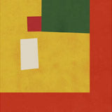
Santhosh Ch is an Indian-born artist whose abstract work draws on the deep chromatic traditions of South Asian art. His paintings are built from layers of saturated colour — reds, golds, indigos, corals — arranged within geometric frameworks that give the intensity somewhere to land. The result is work that feels both instinctive and deliberate: compositions that carry the energy of gestural painting within a structured visual architecture.
Titles like Lavender Whirlwind, Celestial Drift, and Coral Marble Dream hint at the sensory register of these pieces. They are not quiet works. They command attention on a wall and reward it over time as the layering and interaction between hues becomes more apparent. His environmental concerns — urbanisation, disappearing natural landscapes — surface as undercurrents of tension within the colour fields rather than as literal imagery.
Choosing the Right Format
Canvas is the natural home for Santhosh Ch's work. The texture of 400g cotton canvas adds depth to the saturated pigment layers, creating a surface that responds differently depending on light and viewing angle. Available in 30x40cm, 50x70cm, and 70x100cm, with an optional floating frame for a gallery-style presentation. A single 70x100cm canvas print of his work can anchor an entire room.
Fine art paper brings sharper definition to the geometric structures — useful if you want the architectural quality of the composition to read more clearly. Paper prints are available in A3, 50x70cm, 70x100cm, and A0. Framing in oak, black, or walnut brown completes the piece. For Santhosh Ch's warmer palettes, oak frames create a natural tonal connection.
Pairing and Placement
His prints pair well with work by other contemporary artists in the Kuriosis collection who share a commitment to colour-led abstraction. For a curated wall, combine a larger Santhosh Ch canvas with smaller abstract prints in a complementary palette. The bold saturation also works as a counterpoint to more muted, minimalist pieces — the contrast keeps both works visually active.
All prints are produced in our Berlin studio using archival pigment inks rated for 100+ years.


 Swirling Red Essence by Santhosh chFrom CHF 23.00 /
 Coral Marble Dream by Santhosh chFrom CHF 23.00 /
 Celestial Drift by Santhosh chFrom CHF 23.00 /
 Petal Sketch Essence by Santhosh chFrom CHF 23.00 /
 Lavender Whirlwind by Santhosh chFrom CHF 23.00 /
 Eclipse Echoes by Santhosh chFrom CHF 23.00 /
 Lavender Whirl by Santhosh chFrom CHF 23.00 /