What Makes Edward Penfield's Poster Art Distinctive
Penfield served as art director of Harper's Weekly from 1891 to 1901, designing monthly covers that made him one of the most recognized American poster artists of his era. His approach was direct: strong silhouettes built from flat colour fields, bounded by confident outlines, with typography treated as a design element rather than an afterthought. Where European Art Nouveau artists like Mucha leaned into ornamental complexity, Penfield stripped his compositions to essentials — a cyclist in profile, a woman reading, a couple on a city street. The result sits at the exact point where graphic design became a serious discipline, and the best pieces carry an economy that still looks contemporary more than a century later.
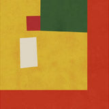
His subjects are drawn from everyday American life in the Gilded Age: bicyclists, readers, figures walking through city streets, women with animals. These are not narrative illustrations — they are graphic statements, each one designed to work at poster scale from across a room. The flat colour and crisp outlines make his work particularly suited to reproduction as fine art prints, where the graphic clarity translates without loss. The colour palette is typically restrained — earth tones, blacks, and occasional warm accents — giving each composition a visual coherence that reads clearly at any distance.
Choosing the Right Format for Penfield Prints
Penfield's graphic style works well across formats. On fine art paper, available in A3, 50×70cm, 70×100cm, and A0, the crisp outlines and flat colour fields retain their full sharpness. Frame options include oak, black, and walnut brown — black frames suit his bold graphic quality particularly well, giving the compositions a precise edge that mirrors his own design sensibility. As a canvas print in 30×40cm, 50×70cm, or 70×100cm, the subtle texture adds warmth to his flat colour areas without softening the essential graphic impact. An optional floating frame gives canvas prints a gallery-level presentation with a clean shadow gap.
Pairing Penfield with Other Artists
Penfield pairs naturally with other artists from the poster art and Art Nouveau tradition. His American perspective contrasts well with European contemporaries like Henri de Toulouse-Lautrec, whose Parisian posters share the same bold graphic language but with a different sensibility. For a broader collection of turn-of-the-century graphic art, consider combining Penfield with works from our vintage poster collection. His restrained palette and clear compositions also work alongside Japanese woodblock prints, where a similar economy of means produces a different visual effect.
All prints are produced in our Berlin studio using archival pigment inks rated for 100+ years.


 Woman Holding Cats by Edward PenfieldFrom €19,99 EUR /