Oktober dreht die Farbe auf: Blumenmärkte von Berlin bis Paris, bunte Papageien und Tukane sowie Zitrus-Stillleben lösen die übliche herbstliche Schwermut ab. Bauhaus-Geometrie und eine verspielte Quallen-Serie sorgen für eine moderne grafische Note, während Road to Nikko und Die große Welle vor Kanagawa bewährte Klassiker einbringen. Einundfünfzig Drucke, ausgewählt für einen leichteren, farbenfroheren Start in die Saison.
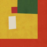
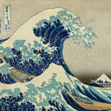
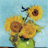
October's selection turns up the colour, with flower markets, bright birds and citrus still lifes replacing the usual autumn moodiness. The flower-market series opens the edit — Potsdam, London, Paris and Berlin Flower Market — alongside Van Gogh's Sunflowers and Almond Blossom. Bright birds get their own corner: Pastel Parrots Paradise and Tropical Toucan by Andrea Haase, Toucans In The Jungle 3, Green Peacock by Koson and Obatan omu Obatan parrot by Hiroshi Yoshida. Citrus and fruit still lifes carry the warmth through — Lime Flower & Lemon Fruit, Antique Lemon and Antique Fruits by Adolphe Millot — while Julia Charlott's jellyfish series and Jellyfishes bring a cooler, playful note. Bauhaus geometry from CATS AND DOTZ and Nico Tracey sits beside Kandinsky's Capricious Form, and proven sellers Road to Nikko by Hasui and The Great Wave of Kanagawa round out the edit with colour that already performs. Browse our full range of flower-market prints and animal prints if you want to extend any of these groupings.
Styling this selection
Most prints here are portrait format, suited to a narrow wall, above a sideboard, or a reading corner. For a gallery wall, group by subject: the flower-market series makes a coherent row of three or four over a console table, while the bird prints — Pastel Parrots Paradise, Tropical Toucan and Green Peacock — pair naturally in a hallway or child's room. If you'd rather a single hero, Road to Nikko or The Great Wave of Kanagawa at 70×100cm anchors a room without companion prints. Because this is a monthly edit rather than a fixed category, the palette is lighter and more varied than a full subject collection, which makes mixing pieces from different subjects easier.
Match by colour temperature first. The yellow and citrus pieces — Antique Lemon, Lime Flower & Lemon Fruit and Van Gogh's Sunflowers — read well against white or pale plaster walls, while the cooler jellyfish and Bauhaus prints cluster better in minimal rooms. Three prints in the same format and a shared palette is usually enough for a balanced wall; there is no need to match subjects exactly. See our bestseller range for proven performers to hang alongside these picks.
Format and framing
All prints come on 225g matte fine art paper in A3, 50×70cm, 70×100cm, and A0. The illustration and still-life pieces read well at 50×70cm or larger, where colour and line register; the photography-led work works across every size. For framing, the citrus and botanical prints pair naturally with Oak, the bird and jungle pieces suit Walnut Brown, and the graphic, high-contrast Bauhaus work reads cleaner in Black. All three frame colours are available from our Berlin studio. For more colour-led work, see our Bauhaus prints.


 Potsdam Flower MarketAb €23,99 EUR /
 London Flower MarketAb €23,99 EUR /
 Paris Flower MarketAb €23,99 EUR /
 Berlin Flower MarketAb €23,99 EUR /
 Almond Blossom von Van GoghAb €23,99 EUR /
 Pastel Parrots Paradise von Andrea HaaseAb €25,99 EUR /
 Toucans In The Jungle 3 von Andrea HaaseAb €25,99 EUR /
 Tropical Toucan von Andrea HaaseAb €25,99 EUR /
 Make Me Feel Jellyfish von Julia CharlottAb €25,99 EUR /
 JellyfishesAb €23,99 EUR /
 Sparkling Horizon Jellyfish von Julia CharlottAb €25,99 EUR /
 Lime Flower & Lemon FruitAb €23,99 EUR /
 Forest Birds VERTICAL von MARYLENE MADOUAb €25,99 EUR /
 Bauhaus - Three Sunflowers von CATS AND DOTZAb €25,99 EUR /
 Antique LemonAb €23,99 EUR /
 Pink Pair von Julia CharlottAb €25,99 EUR /
 Antique Fruits von Adolphe MillotAb €23,99 EUR /
 Green Peacock von KosonAb €23,99 EUR /
 Dapple Abstract Art PrintAb €25,99 EUR /
 Obatan omu Obatan parrot 1926 von Hiroshi YoshidaAb €23,99 EUR /
 Disco tea By Gigi RosadoAb €25,99 EUR /
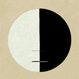
 Capricious Form von Wassily Kandinsky ExhibitionAb €23,99 EUR /
 Energy Kiss Jellyfish von Julia CharlottAb €25,99 EUR /
 Bauhaus Dessau von Nico TraceyAb €25,99 EUR /
 Jungle Collage Yellow von MARYLENE MADOUAb €25,99 EUR /
 Japanese Fishermen von HasuiAb €23,99 EUR /
 7 Birds Japanese von KorinAb €23,99 EUR /
 Cherry Blossom von Kazumasa ExhibitionAb €23,99 EUR /
 Nina Simone Jazz ConcertAb €23,99 EUR /
 Cranes from Momoyogusa-Flowers von SekkaAb €23,99 EUR /
 Spring in Arashiyama von HasuiAb €23,99 EUR /
 Vintage Geometric Floral Art Deco Pattern, Variation 19 von Édouard BénédictusAb €23,99 EUR /
 Disco balls By Gigi RosadoAb €25,99 EUR /
 Bright Air Nail 7 von HENRY HUAb €25,99 EUR /
 Self Portrait with Thorn Necklace and Hummingbird von Frida KahloAb €23,99 EUR /
 Fleur, the classic Vintage Flowers von Adolphe MillotAb €23,99 EUR /
 Bright Air Nail 3 von HENRY HUAb €25,99 EUR /
 The Great Wave of Kanagawa von HokusaiAb €23,99 EUR /
 Three Yellow Chrysanthemum von Kazumasa ExhibitionAb €23,99 EUR /
 Oriental Flowers von Alphonse MuchaAb €23,99 EUR /
 Bright Air Nail 6 von HENRY HUAb €25,99 EUR /
 Flat of the World von GleasonAb €23,99 EUR /
 Road to Nikko von HasuiAb €23,99 EUR /
 Setting Sun, Ichinokura Art Print von KawaseAb €23,99 EUR /
 Zoologischer Garten ZooAb €23,99 EUR /
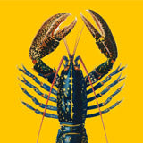
 Gelber HummerAb €23,99 EUR /
 Capricious Forms von Wassily KandinskyAb €23,99 EUR /
 Antique Blue WhaleAb €23,99 EUR /
 Morning Sea at Shiribeshi von HasuiAb €23,99 EUR /
 Pyramid of Capitalism - VintageAb €23,99 EUR /
 Mount Fuji from Lake Yamanaka von Takahashi ShōteiAb €23,99 EUR /