Koopgids · 7 min. leestijd · Kuriosis Studio Team, Berlin · juli 2026
De woonkamer is de moeilijkste ruimte om goed te doen, omdat het de ruimte is waar mensen daadwerkelijk in zitten. Kunst moet hier werken vanaf de bank, vanuit de deuropening, en in het avondlicht, niet alleen goed ogen op een winkelfoto. Het goede nieuws is dat de meeste beslissingen neerkomen op een handvol cijfers en één eerlijke vraag over de sfeer die je wilt. Deze gids behandelt hoogte, formaat, kleur en licht, aan de hand van de normen die musea en lijstenmakers daadwerkelijk gebruiken.
Begin met hoogte: 145 cm tot het midden
De meest gemaakte fout is kunst te hoog ophangen. De norm die musea gebruiken is simpel: centreer het kunstwerk op ongeveer 145 cm vanaf de vloer, gemiddelde ooghoogte. Meet tot het midden van het werk, niet tot de bovenkant. Interieurontwerpers werken met een bereik van ongeveer 145–152 cm, maar 145 cm is het ankerpunt, en het is de hoogte die galerieën zoals MoMA naar verluidt gebruiken.
Boven een bank verandert de rekensom een beetje, omdat het meubel de nieuwe vloer bepaalt. Houd de onderrand van het kunstwerk 15–25 cm boven de rugleuning van de bank, zodat het beeld verbonden aanvoelt met de zitplek in plaats van er los boven te zweven. Als een werk op echte ooghoogte een grote lege ruimte boven de bank zou achterlaten, hang het dan lager om die regel van 15–25 cm aan te houden, de relatie met de bank wint het.
Dan formaat: de tweederderegel
Een werk dat te klein is boven een grote bank is de op één na meest gemaakte fout. De betrouwbare richtlijn is om het kunstwerk, of de hele groepering, ongeveer twee derde tot drie kwart van de breedte van het meubel te laten beslaan. Een bank van 210 cm vraagt bijvoorbeeld om kunst of een opstelling van rond de 140–160 cm breed. Centreer het boven de bank, niet boven de hele muur, zodat de twee elementen als één geheel ogen.
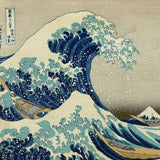
Dat laat twee routes over. Eén groot statement piece, een landschap zoals onze Mountain Range and River, vult de ruimte in één zelfverzekerde beweging en houdt een kamer rustig. Of een cluster van kleinere lijsten bouwt dezelfde oppervlakte op met meer persoonlijkheid. Kies je voor de gallery wall route, behandel dan de hele opstelling als één geheel, centreer dat op 145 cm, en houd ongeveer 5–8 cm tussen de lijsten aan.
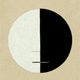
 Bold Contemplation, een statement portret
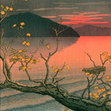
 Vibrant Foliage, kleur en leven
 Contours of Grace, rustig lijnenspel
Kleur: bewust harmoniëren of contrasteren
De keuze rond kleur is niet "match de bank", het is bepalen of je wilt dat de kunst opgaat in de ruimte of juist opvalt, en dat bewust doen. Kleurtheorie biedt twee duidelijke opties. Analoge kleuren staan naast elkaar op het kleurenwiel (blauw en groen, bijvoorbeeld) en voelen rustig en samenhangend aan, kies hiervoor als je wilt dat de kunst opgaat in de kamer. Complementaire kleuren staan tegenover elkaar (oranje en blauw) en zorgen voor veel contrast, kies hiervoor als je wilt dat de kunst het eerste is waar het oog op valt.
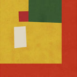
Een praktische truc van interieurontwerpers: gebruik de 60-30-10-regel, waarbij kunst een natuurlijke plek is voor het accent van 10%. Haal één kleur uit het kunstwerk, een roestbruin, een petrolblauw, een mosterdgeel, en laat die ergens klein terugkomen in de kamer, in een kussen of een plaid. Die ene terugkerende kleur is wat een kamer een samenhangend gevoel geeft in plaats van los ingericht aanvoelen. Een werk zoals Vibrant Foliage geeft je een heel palet om uit te putten; een grafisch werk zoals Bauhaus Art 2 geeft je een of twee stevige accenten om mee te werken.
Licht: de factor die de meeste gidsen overslaan
Dit is de factor die je investering beschermt. Conserveringsinstanties zijn duidelijk: lichtschade is cumulatief en onomkeerbaar, het herstelt zichzelf nooit. Het Canadian Conservation Institute merkt op dat blootstelling "aan 100 lux gedurende 400 uur dezelfde schade oplevert als blootstelling aan 50 lux gedurende 800 uur." In gewone taal: een print aan een muur die directe middagzon krijgt, vervaagt veel sneller dan diezelfde print aan een beschaduwde muur.
Er is één nuance die de meeste interieurartikelen verkeerd hebben. UV-glas helpt, het blokkeert de UV-straling die papier bros maakt, maar het American Museum of Natural History wijst erop dat zichtbaar licht eigenlijk de grotere oorzaak is van vervagende pigmenten. UV-glas alleen is dus geen vrijbrief om een print in de volle zon te hangen. De echte regel is allebei: houd kunst weg van een muur die in de volle zon bakt, en lijst het goed in. Een zachter werk zoals Radiant Haze is een goede kandidaat voor een lichtere muur, juist omdat het hele effect ervan licht en gloed is.
Hoogte
Centreer op 145 cm. Boven een bank, houd de onderrand 15–25 cm boven de rugleuning.
Formaat
Beslaat twee derde tot drie kwart van de breedte van het meubel. Gallery walls: 5–8 cm tussen de lijsten.
Kleur
Bewust laten opgaan (analoog) of contrasteren (complementair). Haal één accentkleur de kamer in.
Licht
Vervaging is cumulatief en blijvend. Houd kunst weg van muren in direct zonlicht, en lijst het goed in.
"Blootstelling aan 100 lux gedurende 400 uur levert dezelfde schade op als blootstelling aan 50 lux gedurende 800 uur."
Canadian Conservation Institute, over cumulatieve lichtschade
Bekijk woonkamerprints bij Kuriosis →
Compositie: oriëntatie en oneven aantallen
Twee laatste principes maken het geheel compleet. Ten eerste, stem de oriëntatie af op de muur: brede muren en brede meubels vragen om liggende werken; smalle of hoge muurdelen vragen om staande werken. Een horizontaal landschap zoals de bergscène past van nature boven een lange bank; een verticaal werk zoals Contours of Grace past goed bij een smalle muur naast een deuropening of een hoge boekenkast.
Ten tweede, wanneer je werken groepeert, voelen oneven aantallen, drie, vijf, zeven, natuurlijker aan voor het oog dan symmetrische paren. Drie is het kleinste aantal dat overkomt als een bewuste opstelling in plaats van toeval. Plaats eerst het middelste werk en bouw daaromheen verder. Houd de lijsten consistent, allemaal eiken of allemaal zwart, zodat het oog de set als geheel ziet in plaats van elke lijst apart te lezen.
Meer woonkamerprints uit onze collectie:
 Radiant Haze, zacht en licht
 Mountain Range and River, een statement
 Bauhaus Art 2, een grafisch accent
Waarom fine art prints? De Kuriosis aanpak
We produceren elke print in onze eigen studio in Berlijn met archiefwaardige pigmentinkt, zodat een werk dat met zoveel zorg is gekozen zijn kleur op de muur op de lange termijn behoudt. Bekijk onze woonkamerselectie om het werk te vinden dat bij jouw ruimte past.