What Defines Paul Klee's Art Style
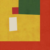
Klee's work resists easy categorisation. He moved between Expressionism, Cubism, and Surrealism without fully belonging to any of them. His Bauhaus period — teaching alongside Wassily Kandinsky in Weimar and Dessau — produced some of his most rigorous colour theory, but his paintings from the same years often look deliberately naive: stick figures, mosaic-like grids, and titles that read like poetry (Joyful Mountain, Persian Nightingales, The Harbinger of Autumn).
The range is part of the point. Klee produced over 9,000 works across painting, drawing, and printmaking. The geometric compositions sit alongside fantastical landscapes, hieroglyphic figures, and abstract colour fields. What holds it together is the sense that each piece is solving a specific visual problem — a relationship between two colours, a balance between line and shape, a joke told in form.
His 1914 trip to Tunisia was a turning point — the Mediterranean light and colour transformed his palette from the muted tones of his early German work to the warm ochres, terracottas, and deep blues that define his mature paintings.
Choosing the Right Format for Klee Prints
Fine art paper is the natural choice for most Klee prints. The geometric compositions, the precise colour relationships, and the delicate line work all read most clearly on a smooth matte surface. Paper prints are available in A3, 50×70cm, 70×100cm, and A0, with oak, black, or walnut brown frames.
The larger formats — 70×100cm and A0 — let the colour field compositions breathe. Klee's grid-based works in particular benefit from scale, where the individual colour relationships become visible. Natural oak frames complement the warm Mediterranean palette of the later work. Black frames suit the more graphic, Bauhaus-era compositions.
Pairing Klee Prints
Klee's work pairs most naturally with his Bauhaus colleague Wassily Kandinsky — they taught side by side and shared a commitment to colour theory, though their visual languages are quite different. Two or three Klee prints alongside a Kandinsky creates a historically grounded modernist grouping.
For a broader abstract arrangement, explore our abstract collection or the wider Bauhaus collection, which includes poster designs and typographic work from the same school. The playful quality of Klee's work also sits well alongside contemporary illustration — his visual humour has more in common with our design and illustration prints than with most of his Modernist contemporaries.
All prints are produced in our Berlin studio using archival pigment inks rated for 100+ years.


 Paul Klee Untitled Art ExhibitionFrom €19,99 EUR /
 Paul Klee Joyful Mountain Art ExhibitionFrom €19,99 EUR /
 Paul Klee Composition with Figures Art ExhibitionFrom €19,99 EUR /
 Paul Klee The Harbinger of Autumn Art ExhibitionFrom €19,99 EUR /
 Paul Klee Persian Nightingales Art ExhibitionFrom €19,99 EUR /
 Paul Klee Hardys Art ExhibitionFrom €19,99 EUR /
 Paul Klee Doctor Art ExhibitionFrom €19,99 EUR /