Joshua Hoskins – Typography and Graphic Art Prints
Joshua Hoskins works where typography meets fine art — prints that use words and letterforms not as labelling or decoration but as primary visual material. His compositions treat text with the same compositional thinking a painter brings to form and colour: where it sits, how much space surrounds it, what weight it carries against the ground.
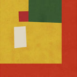
The work is minimalist in approach but not in ambition. A piece built around a single word or statement can be as complex and considered as any abstract composition — the choices about typeface, scale, spacing, and negative space are all expressive decisions. Hoskins makes these decisions with a clarity and purpose that gives even the simplest compositions a sense of visual intelligence.
Format Choices
Typography-led work benefits from the precision of fine art paper. The smooth 225g matte surface renders every letterform edge, weight variation, and spacing relationship with absolute fidelity. Paper prints are available in A3, 50×70 cm, 70×100 cm, and A0. Black frames are the natural companion for graphic, type-driven work — they extend the visual logic of the composition. Oak brings warmth to pieces with a warmer palette or looser typographic treatment.
Canvas works for larger, bolder compositions where the graphic weight of the typography reads well at scale — the 400g cotton surface adds physical presence without losing the legibility these pieces depend on. Canvas prints are available in 30×40 cm, 50×70 cm, and 70×100 cm.
Pairing and Styling
Typography art works well in home offices and living rooms where you want art that communicates as well as decorates. For graphic, design-led contemporary work in a similar vein, explore Greywork Studio or browse the full contemporary artists collection. For more abstract, form-led work, the abstract art prints collection offers a strong counterpoint. All prints produced in our Berlin studio using archival pigment inks rated for 100+ years.


 Abstract Grey House par JoshuaDe €23,99 EUR /
 Colorful Expressive Portrait par JoshuaDe €23,99 EUR /