Abstract art prints — from Hilma af Klint's early twentieth-century geometric compositions to bold contemporary work by Jazzberry Blue and Dan Hobday. Geometric, organic, minimalist, expressive. Curated for colour, form, and staying power.
Abstract art is harder to choose than figurative work — there is no obvious subject to anchor the eye. What you are really choosing is how colour, form, and space make a room feel. The right abstract print holds a wall without needing explanation; the wrong one fades into background noise within a week.
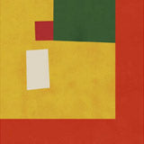
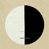
This collection covers four broad approaches. Geometric abstract — clean lines, mathematical form, Bauhaus influence — reads strongly from across a room and works well in offices and modern interiors. Organic abstract — fluid shapes, nature-derived patterns — tends to be warmer and more textural, suited to living rooms and bedrooms. Minimalist abstract — one or two elements with generous space — is particularly effective in groups of three. Expressive abstract — visible gesture and brushwork — is the most painterly category and often strongest on canvas.
The range spans from Hilma af Klint's early twentieth-century geometric work to bold contemporary prints by Jazzberry Blue and Dan Hobday, with hundreds of pieces in between covering every register of abstract art.
Choosing the Right Format for Abstract Prints
Geometric and minimalist abstracts read most precisely on fine art paper, where the clean lines and colour transitions stay sharp and the graphic intention of the work comes through clearly. Paper prints are available in A3, 50×70cm, 70×100cm, and A0, with oak, black, or walnut brown frames.
Expressive and organic abstracts — works with visible brushwork, layered colour, or textural depth — come alive on canvas, where the surface texture adds a painterly dimension that flat paper cannot replicate. Canvas prints come in 30×40cm, 50×70cm, and 70×100cm, with an optional floating frame for a gallery finish.
For framing: black or natural oak with no mount board. Abstract work tends to look strongest when the composition extends to the edge of the frame without interruption. A wide white mount reduces visual weight and can make the piece feel smaller than it is.
Pairing and Arranging Abstract Prints
A triptych of minimalist abstracts in matching frames — same artist, same palette — creates an immediate gallery effect. Mixing artists works too, provided the colour temperature stays consistent: warm with warm, cool with cool. Scale variety adds interest: a larger central piece flanked by two smaller prints is a reliable arrangement.
For related collections, explore Bauhaus posters for the geometric end of the spectrum, or our modern art poster collection for figurative work that shares the same visual energy. Hilma af Klint is a natural entry point for anyone drawn to spiritual or symbolic abstraction.
All prints are produced in our Berlin studio using archival pigment inks rated for 100+ years.
The Swedish painter who produced fully abstract work in 1906, left instructions to hide her most important series for twenty years after her death, and became the most-visited exhibition in...


 Ectoplasm 60 by Jazzberry BlueFrom €23,99 EUR /
 Bold Contemplation by ThingDesignFrom €23,99 EUR /
 14 by Julia PurintonFrom €23,99 EUR /
 Radiant Haze by Dina DankersFrom €23,99 EUR /
 Stormy Horizon by Alice WhiteFrom €23,99 EUR /
 Serene Horizons by MANSI SAXENAFrom €23,99 EUR /
 Flowing Kimono Patterns by THE MIUUS STUDIOFrom €23,99 EUR /
 Whispers of Dusk by MANSI SAXENAFrom €23,99 EUR /
 Bold Blue Orange and White Brushstrokes by MANSI SAXENAFrom €23,99 EUR /
 Bauhaus Musik Vinyl by RetrodromeFrom €23,99 EUR /
 Vintage Japanese Woodblock Print Nr 11From €19,99 EUR /
 Interference by Jazzberry BlueFrom €23,99 EUR /
 Warm Haze Glow by Dina DankersFrom €23,99 EUR /
 Dreamy Wetlands by Dorothy FaganFrom €23,99 EUR /
 Graceful Ascent by Wassily KandinskyFrom €19,99 EUR /
 Colorful overlay 3 by Vitor CostaFrom €23,99 EUR /
 Metal Brushs nº1 by AlmaFrom €23,99 EUR /
 The Woman With the Yellow Stripes by Bea MüllerFrom €23,99 EUR /
 Asiantiger Green by Arty GuavaFrom €23,99 EUR /
 Vivid Bauhaus by Ana Rut BreFrom €23,99 EUR /
 Mountains No2 by Dan HobdayFrom €23,99 EUR /
 Flow 2 by Jazzberry BlueFrom €23,99 EUR /
 Composition aux cercles symétriques by László Moholy-NagyFrom €19,99 EUR /
 Bauhaus art 4 by Vitor CostaFrom €23,99 EUR /
 Vibrant Reflections by TreechildFrom €23,99 EUR /
 Bauhaus Fun by Ana Rut BreFrom €23,99 EUR /
 Book coffee and cake By Gigi RosadoFrom €23,99 EUR /
 Hilma af Klint The Ten Largest nr 2From €19,99 EUR /
 Hilma Af Klint Alterpiece Nr 1From €19,99 EUR /
 Capricious Forms by Wassily KandinskyFrom €19,99 EUR /
 Buddha´s Standpoint by Hilma Af KlintFrom €19,99 EUR /
 Blue lake by Taguchi TomokiFrom €19,99 EUR /
 Line Vase with Flowers by Bea MüllerFrom €23,99 EUR /
 Abstract Geometric Composition -red by Little DeanFrom €23,99 EUR /
 Westcoast by Angela SeearFrom €23,99 EUR /
 Vibrant Foliage by City ArtFrom €23,99 EUR /
 Bauhaus art 2 by Vitor CostaFrom €23,99 EUR /
 Voyage 1 by Dan HobdayFrom €23,99 EUR /
 So What? by Thoth AdanFrom €23,99 EUR /
 Bauhaus Ausstellung 1923 by RetrodromeFrom €23,99 EUR /
 Geometric Expression #3 by jay stanleyFrom €23,99 EUR /
 Leaves More 9 Kopie by Ana Rut BreFrom €23,99 EUR /
 Mocha By Gigi RosadoFrom €23,99 EUR /
 Upward by Wassily KandinskyFrom €19,99 EUR /
 Pompeian Nr 3 by Owen JonesFrom €19,99 EUR /
 Hilma af Klint The Ten Largest nr 3From €19,99 EUR /
 Hilma Af Klint Exhibition The Swan Nr 1From €19,99 EUR /
 Composition VIII by Wassily KandinskyFrom €19,99 EUR /