Vintage travel posters and travel-inspired art — Belle Epoque railway advertising, ocean liner graphics, Art Deco destination prints, Japanese travel woodblock. The golden age of travel poster design, when every destination was sold with the confidence of hand-drawn lithography.
Travel poster art reached its peak between 1900 and 1940 — the era when rail, ocean liner, and early aviation made long-distance travel newly possible, and advertising needed to make it irresistible. The artists who defined the genre understood something about aspiration and image that modern advertising still borrows from.
Jules Chéret pioneered the colour lithography that made travel posters possible. Roger Broders created the definitive French railway posters — romanticised views of the Côte d'Azur, the Alps, and provincial France that still define how we imagine those places. Cassandre applied Art Deco geometry to ocean liner advertising, creating some of the most recognisable poster designs of the twentieth century. This collection spans all of these movements and more, from Belle Époque romanticism through Art Deco precision to mid-century modernism.
Beyond European travel advertising, the collection includes Japanese travel woodblock prints — Hasui Kawase and Hiroshige captured specific places with specific light. These read as travel art without any advertising intent, and they pair naturally with the European poster tradition.
Choosing the Right Format for Travel Posters
Travel posters were made for print — flat colour fields, confident typography, bold composition. These qualities read most accurately on fine art paper, where the graphic precision of the original lithographic process is preserved. Paper prints are available in A3, 50×70cm, 70×100cm, and A0, with oak, black, or walnut brown frames.
On canvas, the surface texture adds warmth that suits the more painterly Belle Époque pieces — the romanticised destination views with soft skies and warm tones gain depth from the canvas surface. Canvas prints come in 30×40cm, 50×70cm, and 70×100cm, with an optional floating frame.
For framing: natural oak complements the warm tones of Belle Époque travel advertising. Black frames sharpen the geometry of Art Deco posters and modernist railway graphics.
Pairing and Displaying Travel Posters
Travel posters work well in groups of two or three with consistent framing — the graphic confidence of the originals means they hold their own at any scale. A pair of Côte d'Azur posters from the same era creates an immediate visual statement. Mixing periods also works: a Belle Époque railway poster alongside an Art Deco ocean liner design shows the evolution of travel advertising without clashing.
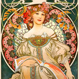
For related collections, explore our vintage poster collection for the broader design tradition that travel posters belong to. Alphonse Mucha shares the Art Nouveau aesthetic of the earliest travel advertisements. The landscape collection offers a complementary approach to place and geography through fine art rather than commercial design.
All prints are produced in our Berlin studio using archival pigment inks rated for 100+ years.


 Berlin Tram by Rosi FeistFrom €40,99 EUR /
 Berlin Tram by Rosi FeistFrom €23,99 EUR /
 AllgaI_x0088_u Alps by Rosi FeistFrom €40,99 EUR /
 AllgaI_x0088_u Alps by Rosi FeistFrom €23,99 EUR /
 Berlin Hkw by Rosi FeistFrom €40,99 EUR /
 Berlin Hkw by Rosi FeistFrom €23,99 EUR /
 Dynamic Mountain Skiing by HUGOFrom €40,99 EUR /
 Dynamic Mountain Skiing by HUGOFrom €23,99 EUR /
 Ski Lift Mountain Fun by Claire HanleyFrom €40,99 EUR /
 Ski Lift Mountain Fun by Claire HanleyFrom €23,99 EUR /
 SwedenFrom €37,99 EUR /
 Vintage Travel Art by NicholasFrom €40,99 EUR /
 San Fransisco Travel Poster by Andreas MagnussonFrom €40,99 EUR /
 Malmö Travel Poster by Andreas MagnussonFrom €40,99 EUR /
 Rome Travel Poster by Andreas MagnussonFrom €40,99 EUR /
 Tranquility and Relaxation Japanese Travel Poster by NicholasFrom €40,99 EUR /
 Oriental city under a starry sky in bright colours by Caroline Bonne MüllerFrom €40,99 EUR /
 The Sagrada Familia, Barcelona by Artist Carla DalyFrom €40,99 EUR /
 Eiffel Tower with Paris City in Background by Artist Carla DalyFrom €40,99 EUR /
 London City with View of the Thames River and Big Ben by Artist Carla DalyFrom €40,99 EUR /
 Times Square, New York Illustration by Artist Carla DalyFrom €40,99 EUR /
 New Orleans Louisiana Vintage Travel Poster by The Whiskey GingerFrom €40,99 EUR /
 Lady in Stripe by Arty GuavaFrom €40,99 EUR /
 Yellow Van by Florent BodartFrom €40,99 EUR /
 Little Yellow Club - Plane by Florent BodartFrom €40,99 EUR /
 Stockholm Flower MarketFrom €37,99 EUR /
 Alpine Glow Skiing by HUGOFrom €40,99 EUR /
 Alpine Glow Skiing by HUGOFrom €23,99 EUR /
 Aviation LarousseFrom €37,99 EUR /
 Copenhagen DenmarkFrom €37,99 EUR /
 Great Barrier ReefFrom €37,99 EUR /
 Côte d'AzurFrom €37,99 EUR /
 CanadaFrom €37,99 EUR /
 The Rocky MountainsFrom €37,99 EUR /
 ItalyFrom €37,99 EUR /
 Venice ItalyFrom €37,99 EUR /
 RomaFrom €37,99 EUR /
 MadridFrom €37,99 EUR /
 New York with Statue of LibertyFrom €37,99 EUR /
 JapanFrom €37,99 EUR /
 Hong KongFrom €37,99 EUR /
 AlaskaFrom €37,99 EUR /
 Valencia Oranges by Andreas MagnussonFrom €40,99 EUR /
 Book Cafe by Jukyong ParkFrom €40,99 EUR /
 Abstract Arches by Emel TunaboyluFrom €40,99 EUR /
 Starburst Flora by Emel TunaboyluFrom €40,99 EUR /
 Triangular Redwood by Emel TunaboyluFrom €40,99 EUR /
 Geometric Sunrise by Emel TunaboyluFrom €40,99 EUR /