BUYING GUIDE · 12 min read · Kuriosis Studio Team, Berlin · November 2026
Dining room art is looked at by people who are sitting down, for an hour at a time, across a table. That changes the size that works, the height it should hang at, and which dining room pictures you can live with over a few hundred dinners. This guide covers the subjects that suit the room, the width to aim for above the table and the sideboard, the hanging height when everyone is seated, and what to do when the table shares a room with the hob.
The short answer
Hang one art print, or a group that reads as one, about two-thirds as wide as the table or sideboard below, with its centre near 145 cm and its lower edge 10 to 20 cm above the furniture. For a 180 cm table that is a picture about 120 cm wide: a 70 × 100 cm art print in landscape format, or two 50 × 70 cm prints side by side. When the eye-level rule and the furniture gap disagree, the gap wins. Choose a subject you can look at every evening: a still life, a café poster, a Japanese landscape or a calm abstract. In a kitchen diner, keep the frame away from the hob and out of direct sun, behind an acrylic front.
What art works in a dining room?
Food, drink and flowers have been dining room art for four hundred years and still work. Café posters belong in a room where people drink, Japanese landscapes and quiet abstracts give the eye somewhere to rest between courses. Dutch painters made a genre of it, and the National Gallery in London counts Floris van Dijck among Haarlem's most important pioneers of still-life painting. His A Banquet Still Life from 1622 shows a table laden with bread, cheese, fruits and luxurious glassware, and the gallery notes that many of the genres Dutch painting is known for were first developed in that city. At Kenwood in London, English Heritage says of Frans Snyders' Figures with Fruit and Game from about 1635 that the food would have whetted the appetite of dinner guests. The French aristocracy went further and commissioned still lifes to hang by the dining table.
The modern still life is lighter on the plate and bolder in colour. Cézanne's The Basket of Apples, painted around 1893 and now at the Art Institute of Chicago, sits on a table tilted with no right angles, which is part of why it still looks fresh. Matisse's Végétaux is a cut-out from 1951, gouache on paper, 175 × 81 cm in the original, listed in MoMA's checklist for its 2014 cut-outs exhibition as a private collection. Georges Valmier's Flowers and Fruit from 1924 comes from a painter who found Cubism in his mid-twenties and moved into abstraction from 1921, so the fruit is there, but only just. For the wall beside a kitchen, the two oranges at the top of this page by Kubistika and Wine and Blooms by Treechild do the same job with fewer brushstrokes.
Café posters are the second family. Théophile Steinlen drew Tournée du Chat Noir in 1896 to advertise the touring troupe of the Montmartre cabaret, which Rodolphe Salis had opened in 1881. Alphonse Mucha's Bières de la Meuse from 1897 is a colour lithograph printed by F. Champenois in Paris, roughly 155 × 105 cm in the original, with a woman wearing a wreath of poppies, wheat and hops and holding a pint of beer. Both were made to be read across a crowded room, which is exactly the view from the far end of a dining table. Our Mucha guide has more on the posters.
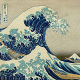
Japanese landscape prints are the quiet option. Kawase Hasui's Setting Sun, Ichinokura belongs to his series Twenty Views of Tokyo, and the Art Institute of Chicago dates the sheet to 1928; his Autumn in Oirase was published by Watanabe Shōzaburō in June 1933. Both are small sheets in the original, around 26 × 39 cm; in our experience they take enlargement to 50 × 70 cm well because the colour areas are flat. Ogata Kōrin, the Kyoto painter who revived the Rinpa school and gave it his name and died in 1716, is the name on our 7 Birds print; two of his screen pairs are National Treasures in Japan. Hasegawa Keika's One Hundred Chrysanthemums is a three-volume woodblock book from 1893, a single stem per plate, which makes a tidy pair or trio above a sideboard. Our Hasui guide covers his career.
Botanical and scientific plates sit between the two. Ernst Haeckel's mushroom plate is number 63 of Kunstformen der Natur, published between 1899 and 1904 and lithographed by Adolf Giltsch in Jena; our Mushroom Forest print reproduces it. Pieter De Pannemaeker, active in Ghent in the 1880s, drew and lithographed plates for L'Illustration Horticole and Lindenia; the Jubaea spectabilis palm is one of them. Plates like these read as pattern from across the room and as drawing from the chair.
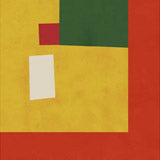
Abstracts work when they are big. Havenly's dining room guide puts it plainly: abstract art needs to be oversized to anchor the eye. Otto Freundlich's Komposition comes from a painter Wikipedia counts among the first generation of abstract artists; he was born in Pomerania in 1878 and murdered at Majdanek in 1943. At 70 × 100 cm his blocks of colour hold a wall on their own. On the old claim that red and orange walls make people hungry: we could not find a reputable study that shows it. The best-known research on colour and appetite, Charles Spence's 2015 review in Flavour, is about the colour of the food itself, which it calls the single most important product-intrinsic sensory cue for taste expectations. Choose warm colours because you like them.
What size should art be above a dining table?
Art above a dining table should be about two-thirds the width of the table, measured on the wall behind it, and a group of prints counts as one picture. Studio McGee gives the rule for anything hung above furniture, including a dining bench: choose artwork or a grouping that spans approximately two-thirds the width of the furniture. Interior designer Cliff Fong measures the wall instead and tells Livingetc to pick art no less than two-thirds the width or height of the wall, and the magazine adds that the rule is not set in stone; Fong himself says a deliberately small painting on a big wall can work because it forces the eye. Designer Amanda Shields describes the two failures in one sentence for Homes & Gardens: a small piece on a large wall looks lost, a collection of small pieces on a small wall feels cluttered.
Put numbers on it, using our own arithmetic from the two-thirds rule and the sizes we make. A 160 cm table asks for about 105 cm of picture: a 70 × 100 cm art print in landscape format, or an A0 sheet (84 × 119 cm) if the wall is tall enough. A 200 cm table asks for about 130 cm: two 70 × 100 cm prints in portrait format with a 5 cm gap come to 145 cm, which is a touch over and looks right. Three 50 × 70 cm prints in portrait with the same gaps come to 160 cm, so they suit a 240 cm table. A row of A3 sheets (29.7 × 42 cm) in portrait only reaches that width at five or more, and five small frames behind a table read as a noticeboard from the other side. Our print size guide has the viewing distances; the table wall is usually seen from 2 to 3 m, which is where 70 × 100 cm starts to look like the right scale.
The format matters as much as the width. A table is a horizontal object, so a landscape print or a horizontal pair sits more naturally above it than one tall portrait sheet. Above a sideboard the same logic applies, and the sideboard is usually where the art actually hangs, because most dining tables stand in the middle of the room with chairs on every side.
How high do you hang art in a dining room?
Start with the centre of the print at 145 to 152 cm, then lower it until the frame sits 10 to 20 cm above the sideboard or the chair backs. The starting figure is the gallery standard. Jason Wickens tells Livingetc that the 57-inch rule simply means placing the center of the artwork 57 inches, or 145 cm, from the floor; art advisor Kelly Cahn, in the same piece, prefers about 150 cm and adds that proportion and context should adjust it. Over furniture the gap takes over. Cahn puts the lowest point of the frame 15 to 30 cm above the top of the furniture. Homes & Gardens says pictures look best with the bottom of the frame around four to eight inches above the top of the piece of furniture, which is 10 to 20 cm. Ideal Home quotes Margaret Lawson of Sustainable Furniture at 8 to 10 inches regardless of eye level. The spread is 10 to 30 cm, and the tighter end looks better over a sideboard that is itself a tidy object.
Dining rooms have one extra argument for going low. Everyone in the room is seated for most of the time they spend there, and seated eye level is well below 145 cm. Wickens makes the point for living rooms, where you may want artwork a little lower because everyone is sitting, and it applies with more force to a room where nobody stands except to clear the plates. The counterweight is the chair. Designers Trish Knight and Nicole Varga, talking about a sofa, tell Homes & Gardens to pick a height that won't get knocked by people sitting in front of it and is still not so high that it disconnects from the furniture; a dining chair is the same problem. Our studio rule: measure the top of your chair backs when a chair is pushed in against the wall, add 10 to 15 cm, and that is the lower edge of the frame. If that puts the centre at 135 cm rather than 145, trust the chairs.
Homes & Gardens describes what happens when you ignore all this and hang high: the pictures feel more connected to the ceiling, which makes the room feel the opposite of cozy. A dining room is meant to be cozy, so err low.
Subject
Something you can look at for an hour. Still lifes, café posters, Japanese landscapes, botanical plates and large abstracts all pass that test; busy scenes with small figures do not, because the eye keeps reading them.
Width
Two-thirds of the table or sideboard below. One 70 × 100 cm art print in landscape for a 160 cm table, a pair of 70 × 100 cm portraits for 200 cm, three 50 × 70 cm for 240 cm. A group counts as one picture.
Height
Centre at 145 to 152 cm as the starting point, then down until the lower edge is 10 to 20 cm above the sideboard or the pushed-in chair backs. In a room where everyone sits, lower beats higher.
Light
Not opposite the window and not above the radiator. Daylight fades paper and glass throws it back at the table; a side wall with an acrylic front and a warm lamp aimed at the print is the safe setting.
 Bières de la Meuse by Alphonse Mucha
 Keika Hyakugiku Pl. 12 by Hasegawa Keika
 Bitter Orange Flower
Browse Dining Room Art Prints →
How do you make a dining room feature wall with prints?
Pick the wall you see from the doorway, hang one oversized art print or a tight group of three on it, and leave the other walls almost empty. Havenly's designers say that a single piece of oversized artwork is sometimes all you need, and one of their examples is a pair of large abstracts on a black wall, which is the feature-wall idea in its simplest form, dark paint and big colour. Kathy Kuo of Kathy Kuo Home gives Homes & Gardens the two routes: two or three small groups can give the illusion of a full gallery wall, and one large striking piece in the middle of a wall can also look fantastic. The magazine's own dining example is a triptych in greens that marks off the dining zone in an open-plan room.
For a group, use the numbers that gallery walls use. Keep 5 to 8 cm between frames; Homes & Gardens gives two to three inches and Studio McGee the same. Take an odd number, three or five, which Amanda Shields calls more balanced and visually interesting. Treat the group as one picture: Kelly Cahn centres the group on a focal point and builds out from there, and Annica Wallin suggests thinking of the gallery wall as one large picture. Groups can also sit closer to the furniture than a single frame; Livingetc gives about 15 cm rather than 30. Same frame colour throughout, oak or black or brown, and the same paper, so the only thing that varies is the image. Our guides to building a gallery wall and seven ways to hang prints go through the layouts.
Two things a dining feature wall does not need: wallpaper and art competing on the same wall, and a second feature wall opposite. Havenly's advice on patterned paper is to treat the wallpaper as the statement and keep artwork minimal. If the paper is on the table wall, hang the prints on the plain wall beside it.
What wall art works in a kitchen diner?
A framed art print behind acrylic, on the wall furthest from the hob and out of direct sun. The kitchen half of an open-plan room makes steam and heat every evening, and both reach the dining half. The US Environmental Protection Agency's advice for the whole house is to use exhaust fans or open windows whenever cooking and keep indoor humidity under 60 percent. Paper wants roughly the same: the Institute of Conservation puts the ideal for art on paper at 45 to 60 percent relative humidity and says a low, stable level under 60 percent slows the paper's deterioration. The Canadian Conservation Institute gives the figures for when things go wrong: mould can grow in two days at 90 percent humidity, ten days at 80 and a hundred days at 70, and it sets the ceiling for paper at 65 percent. We have not measured it, but a kitchen diner without an extractor and with a pot on the boil can get close; one with the extractor running should not.
Light is the other problem, because kitchen diners often have the biggest windows in the house. The Institute of Conservation's first instruction for prints is to protect framed prints from daylight and it recommends UV-filtering glass or acrylic. The museum norm for works on paper is 50 lux, which no kitchen will meet and no home needs to; the Canadian Conservation Institute's own table puts light from a window at around 5,000 lux and average daylight at 30,000, which is the gap to avoid. Hang the print on the wall at right angles to the window rather than facing it, and you also lose the glare on the acrylic that makes a picture unreadable from the table. Hannah Rouch adds the two spots to skip in Ideal Home: direct sunlight without UV glazing, and above radiators. The Institute of Conservation explains the radiator: it dries the air and concentrates dirt by convection currents.
Grease is the thing nobody measures. We found no conservation body that gives a safe distance from a hob, so this is studio practice rather than science: if a wall gets a film after a week of frying, a frame on it will too, and an acrylic front wipes clean while bare paper and canvas do not. The Library of Congress puts keeping food and drink away on its short list of handling rules for works on paper, which in a kitchen diner means a front on the frame. That is the case for a framed paper print over a canvas print anywhere near the cooking; our canvas versus art print guide compares the two finishes for drier rooms. On the subject, a kitchen diner takes the same motifs as a dining room plus the botanical plates: Haeckel's mushrooms and Pannemaeker's palm are drawings of things that grow, and they look at home a few metres from a chopping board.
Common mistakes with dining room art
Five mistakes account for most dining room artwork that looks wrong, and each has a measurement that fixes it.
Hung too high. This is the one we see most: the print floats halfway to the ceiling with 40 cm of bare wall above the sideboard. Drop it until the lower edge is 10 to 20 cm above the furniture, even if the centre ends up at 135 cm.
Too small for the wall. One 50 × 70 cm art print over a 200 cm table covers a quarter of the width in portrait, a third in landscape, and looks like an afterthought either way. Two-thirds is the target, so pair it, or go to 70 × 100 cm, or A0.
Too many small frames. Six A3 prints in a line behind the chairs read as clutter from across the table, the collection of small pieces on a small wall that Amanda Shields warns about. Hang three larger sheets, or one.
Facing the window. Daylight fades the print over the years and the acrylic mirrors the window at dinner. Move it to the side wall or fit UV-filtering acrylic.
Over the radiator or near the hob. Heat dries and warps paper, and cooking films the frame. Both the Institute of Conservation and Ideal Home's experts name the radiator; the hob is our addition. Use the wall opposite the kitchen run.
Quieter prints for the sideboard wall:
 Setting Sun, Ichinokura by Kawase Hasui
 7 Birds by Kōrin
 Dreamy Wetlands by Dorothy Fagan
Questions
What do you hang above a sideboard?
One landscape art print or a matched pair, about two-thirds as wide as the sideboard, with the lower edge 10 to 20 cm above its top. Havenly's dining page gives 6 to 12 inches over a buffet or console; Studio McGee names one large piece over a console as a layout that suits dining rooms. Leave room for whatever lives on the sideboard, so a lamp or a vase does not cut across the picture.
One large print or a set?
One large print if the wall is the feature and you want it read from the door; a set of three if the wall is long and the table is too. A 70 × 100 cm art print is the single-piece size for most tables; three 50 × 70 cm prints in matching frames cover a 240 cm sideboard. Keep sets in odd numbers and in one frame colour, and never mix a set with a second group on the same wall.
Do warm colours in dining room art make people hungrier?
We could not find a reputable study that shows it. Charles Spence's review of colour and appetite concerns the colour of the food, and the lighting studies behind the restaurant folklore are small and hard to find in full. Pick the oranges and the beer poster because they suit the room.
How we make them
Every print on this page is made in our own studio in Berlin, with archival pigment inks on Fine Art Paper or canvas. We produce, frame and pack each one ourselves, and if you send us a photo of your table wall with its width, we will tell you which size and how many.
Sources & Further Reading
- Livingetc: How high should you hang art? (Kelly Cahn, Jason Wickens, December 2025)
- Homes & Gardens: How high to hang pictures (Chiana Dickson, October 2022)
- Homes & Gardens: How many pictures should you hang on a wall? (Zara Stacey, May 2023)
- Livingetc: Art hanging mistakes designers notice (Cliff Fong, Annica Wallin, August 2024)
- Ideal Home: How to hang pictures on a wall (updated January 2024)
- Studio McGee: How to hang art (two-thirds rule, furniture gap)
- Havenly: 21 dining room wall decor ideas (updated July 2026)
- Institute of Conservation (UK): Caring for your collections, art on paper
- Canadian Conservation Institute: Caring for paper objects (humidity, mould timing, light levels)
- Library of Congress: Care, handling and storage of works on paper
- Canadian Conservation Institute: Agent of deterioration, light, ultraviolet and infrared
- US Environmental Protection Agency: A brief guide to mold, moisture and your home
- National Gallery, London: Floris van Dijck, A Banquet Still Life (1622)
- English Heritage: Kenwood collection highlights (Frans Snyders, Figures with Fruit and Game)
- Mucha Foundation: Poster for Bières de la Meuse (1897)
- Art Institute of Chicago: Kawase Hasui, Setting Sun, Ichinokura, Ikegami (1928)
- Rijksmuseum: Kawase Hasui, Autumn in Oirase (1933)
- MoMA: Henri Matisse, The Cut-Outs, exhibition checklist (2014)
- Mediamatic: Ernst Haeckel, Kunstformen der Natur, plate 63 Basimycetes
- Charles Spence: On the psychological impact of food colour, Flavour (2015)