Orange runs through this selection in every register: sun-ripe still lifes of oranges and lemons, bold graphic silhouettes, botanical bursts of colour, and playful illustration. Some pieces lean warm and citrusy, others punch through in pure saturated pigment, from Hilma af Klint's early abstraction to Daniel Coulmann's minimal sport courts. What holds it together is colour confidence: orange used to anchor a room, not just accent it. Every piece is printed to gallery standard in our Berlin studio.
Orange shows up here in every mood: sun-ripe still lifes of oranges, lemons, and citrus cocktails; bold graphic silhouettes and colour-block abstraction; botanical bursts from poppies to daffodils; and a scattering of playful illustration, sardines, flamingos, a sea lion. Hilma af Klint's The Ten Largest brings early twentieth-century abstraction into the mix, while Daniel Coulmann's minimal sport courts and THE MIUUS STUDIO's graphic silhouettes carry the colour into a cleaner, more contemporary register. Between the two extremes sits a wide middle ground of warm still life and botanical work, orange used as the anchor colour rather than an accent.
Choosing paper or canvas
The graphic and abstract pieces — Orange Silhouette, Bold Color Blocks, Geometric Echoes, the sport court series — hold their flat colour and hard edges best on fine art paper, in A3, 50×70cm, 70×100cm, and A0. The more painterly and illustrative work, the citrus still lifes, the botanical bouquets, Coral Dreams, reads with extra warmth on canvas, where the woven surface softens the colour rather than flattening it. Canvas comes in 30×40cm, 50×70cm, and 70×100cm, with an optional floating frame. Black frames sharpen the graphic pieces; oak keeps the citrus and botanical work feeling warm rather than clinical.
Styling an orange wall
Orange is a confident colour to build a wall around rather than sneak in. A single large piece, Orange Orchard Elegy or Vibrant Orange and Yellow Flowers, works as a standalone anchor on a kitchen or dining wall. For a grouping, keep the format consistent and let the orange do the work: three still lifes and one graphic piece read as a considered set rather than a clash. It pairs naturally with our Food & Drink and Botanical collections for a warmer kitchen wall, or with the cooler, more graphic pieces in Abstract if you want the colour to read as pure pigment rather than subject matter.


 Sardines on Orange by Alice StrakerFrom €25,99 EUR /
 Vibrant Orange And Yellow Flowers by Susan BlackFrom €25,99 EUR /
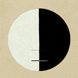
 Hilma af Klint The Ten Largest nr 3From €23,99 EUR /
 Orange Strokes by Ejaaz HaniffFrom €25,99 EUR /
 Woman With Orange Dots by Bea MüllerFrom €25,99 EUR /
 Coral Dreams by TreechildFrom €25,99 EUR /
 Lemons Blue Orange Papiers Découpés Art ExhibitionFrom €23,99 EUR /
 Daffodils On Red by NadjaaFrom €25,99 EUR /
 Monograph Orange Flowers by amini54From €25,99 EUR /
 Geometric Echoes by THE MIUUS STUDIOFrom €25,99 EUR /
 Colorful Poppy Bouquet by NadjaaFrom €25,99 EUR /
 Basketball Court Minimal by Daniel CoulmannFrom €25,99 EUR /
 Lemon Dreams by TreechildFrom €25,99 EUR /
 Tangerine Flamingos by City ArtFrom €25,99 EUR /
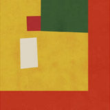
 Bold Color Blocks by Vitor CostaFrom €25,99 EUR /
 Citrus Blush Cluster by Frida Floral StudioFrom €25,99 EUR /
 Two Oranges by KubistikaFrom €25,99 EUR /
 Refreshing Orange Cocktail by Jolly and DashFrom €25,99 EUR /
 Red, Orange, and Peach Floral by Karin LauriaFrom €25,99 EUR /
 Orange Silhouette by THE MIUUS STUDIOFrom €25,99 EUR /
 Orange Orchard Elegy by TreechildFrom €25,99 EUR /
 No Place to Be by Studio IMOFrom €25,99 EUR /
 Orange Pickleball Court by Daniel CoulmannFrom €25,99 EUR /
 Beautiful Fresh Oranges by NicholasFrom €25,99 EUR /
 Zoologischer Garten Sea Lion by GartenFrom €23,99 EUR /
 Flower dress by NKTNFrom €25,99 EUR /
 Orange Teal Love by Andreas MagnussonFrom €25,99 EUR /
 Ginkgo Leaves Abstract by Janel BraggFrom €25,99 EUR /
 The Boston Sunday herald, ladies want it Feb 24 by Ethel ReedFrom €23,99 EUR /
 Fresh Oranges Still Life by ViktoriiaFrom €25,99 EUR /
 Vibrant Orange Flowers by NadjaaFrom €25,99 EUR /