July’s edit leans into summer: citrus still lifes, Mediterranean travel posters, and golden-hour landscapes. Andreas Magnusson’s Valencia Oranges and Ohkimiko’s Limoncello sit beside travel scenes of Lisbon, Roma and Barcelona, with sunset work from Angelo Cerantola and Luisa Millicent. Forty prints, picked for warm colour and long light.
July's selection is built for summer: citrus, coastlines, gardens, and long golden light. Fruit and still-life work leads the edit, with Andreas Magnusson's Valencia Oranges, Ohkimiko's Limoncello and Aperol Spritz watercolours, cartissi's Citronnade Blue and Red, and Susan Black's Strawberries in a Checkered Bowl. Travel posters run alongside: Lisbon, Roma, Paris, the Sagrada Família in Barcelona, and Caroline Bonne Müller's Mediterranean coast. Garden and floral work threads through the middle, from Sophie Robinson's Jardin Majorelle and Marylène Madou's Vegetable Garden to Edie's Abstract Floral Garden and Karin Lauria's Butterfly and Moth in Garden. Sunset and landscape pieces close it out, from Angelo Cerantola's Fiery Sunset Sky to Luisa Millicent's Golden Autumn Sunset. Browse our full range of travel posters and botanical prints if you want to extend any of these groupings.
Styling this selection
Most prints here are portrait format, which suits narrow walls, the space above a desk, or a hallway run. For a gallery wall, group by theme: the citrus and kitchen pieces (Limones, My Lemon Garden, Lemon Illustration, Bitter Orange Flower) sit naturally together over a counter or dining wall. The travel posters (Lisbon, Roma, Snowdonia, Times Square) make a coherent set for a hallway or study. If you'd rather a single hero, a sunset piece like Red Sun Flight or Fiery Sunset Sky at 70×100cm anchors a living-room wall without companion prints. Because this is a monthly edit rather than a fixed category, the colour palette is tighter than a full subject collection, which makes mixing pieces from different subjects easier.
Match by colour temperature first. The warm citrus and Mediterranean work reads well on white or pale plaster walls, while the cooler, more graphic pieces (Florent Bodart's Squarred Door, the Tokyo and New York travel posters) cluster better in minimal rooms. Three prints in the same format and a shared palette is usually enough for a balanced wall; there is no need to match subjects exactly. See our full poster range for proven performers to hang alongside these picks.
Format and framing
All prints come on matte fine art paper in A3, 50×70cm, 70×100cm, and A0. The graphic travel posters and typographic work read best at 50×70cm or larger, where line and detail register; the watercolour and botanical pieces work across every size. For framing, the warm-toned citrus prints pair naturally with Oak, the Japanese woodblock work by Hiroshi Yoshida suits Walnut Brown, and the graphic modern pieces read cleaner in Black. All three frame colours are available from our Berlin studio. For more colour-led work, see our botanical and travel poster collections.


 Lisbon by Maja TomljanovicFrom €23,99 EUR /
 Bitter Orange FlowerFrom €19,99 EUR /
 RomaFrom €19,99 EUR /
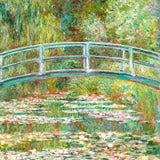
 Waterlillies by Claude MonetFrom €19,99 EUR /
 Valencia Oranges by Andreas MagnussonFrom €23,99 EUR /
 Vegetable Garden by Marylène MadouFrom €23,99 EUR /
 Yellow Painting by Wassily KandinskyFrom €19,99 EUR /
 Travel poster woman in Mediterranean coast by Caroline Bonne MüllerFrom €23,99 EUR /
 Sunny By Gigi RosadoFrom €23,99 EUR /
 Lisbon Flower MarketFrom €19,99 EUR /
 Limoncello, Aquarell, Fresh by OhkimikoFrom €23,99 EUR /
 Aperol Spritz, Aquarell, Fresh by OhkimikoFrom €23,99 EUR /
 Lady in Stripe by Arty GuavaFrom €23,99 EUR /
 Let's Go for a Bike Ride by Sue GraefFrom €23,99 EUR /
 Steam Locomotive by NicholasFrom €23,99 EUR /
 Paris Sunset CityFrom €19,99 EUR /
 Limones by EMELIEmariaFrom €23,99 EUR /
 Orange Orchard Elegy by TreechildFrom €23,99 EUR /
 Lemon Illustration by NicholasFrom €23,99 EUR /
 Tranquility and Relaxation Japanese Travel Poster by NicholasFrom €23,99 EUR /
 Fiery Sunset Sky by Angelo CerantolaFrom €23,99 EUR /
 Jardin Majorelle by Sophie RobinsonFrom €23,99 EUR /
 Nice Travail et Joie by Henri MatisseFrom €19,99 EUR /
 Times Square, New York Illustration by Artist Carla DalyFrom €23,99 EUR /
 The Boston Sunday herald, ladies want it Feb 24 by Ethel ReedFrom €19,99 EUR /
 Golden Autumn Sunset by Luisa MillicentFrom €23,99 EUR /
 Sun-kissed Bed Sheets by Andrea SchindlerFrom €23,99 EUR /
 Red Sun Flight by zarish chaudhryFrom €23,99 EUR /
 Citronnade Blue and Red by cartissiFrom €23,99 EUR /
 My lemon garden by Raissa OltmannsFrom €23,99 EUR /
 Butterfly and Moth In Garden by Karin LauriaFrom €23,99 EUR /
 Abstract Floral Garden by EdieFrom €23,99 EUR /
 Sekishozan Shizhongshan - 1940 by Hiroshi YoshidaFrom €19,99 EUR /
 The Sagrada Familia, Barcelona by Artist Carla DalyFrom €23,99 EUR /
 Snowdonia National Park Travel Poster by RetrodromeFrom €23,99 EUR /
 Strawberries In A Checkered Bowl by Susan BlackFrom €23,99 EUR /