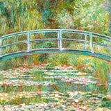
June's edit is built around colour: bold botanical paintings, graphic illustration, and modernist classics from Mondrian and Freundlich alongside contemporary work by Florent Bodart and Gōyō Hashiguchi. Browse the full June edit below.
June’s picks follow a clear visual logic: high-saturation colour, strong graphic line, and prints that hold attention at distance. Contemporary illustrators like Florent Bodart and Retrodrome sit alongside early modernist painters — Mondrian’s geometric abstraction, Otto Freundlich’s vivid compositions, Georges Valmier’s cubist energy. Botanical and still-life work fills the middle: florals by Goed Blauw and Tanigami Konan, kitchen prints by Rosi Feist and Viktoriia Saunina, and figurative pieces by Treechild and Magdalena Krzak that lean expressive rather than decorative.
The variety is intentional. A monthly curated selection works best when it can serve different rooms in the same home — a Florent Bodart graphic print in a study, a Gōyō Hashiguchi woodblock in a bedroom, a still-life pair in a kitchen. June’s mix is strong enough on colour that a single print reads just as well as a coordinated set of three.
If you’re building towards a gallery wall, the collection has clear groupings: music and culture (Miles Davis, Surreal Tokyo Jazz Night, Cavern Club), contemporary botanical (Lilac Summer, Daffodil No.2, Vibrant Abstract Blooms), and graphic modernism (Mondrian, Freundlich, Valmier). Each group is coherent enough to hang together without further curation. Browse our full range of abstract prints and botanical posters if you’re extending any of these groupings.
Styling this selection
Most prints in this edit are portrait format — well-suited for narrow walls, above desks, or hallway runs where width is limited. For a gallery wall, match by colour temperature first: the warm-toned pieces — Citronnade Blue and Red, Colorful Pears, Chilli Sauce — read naturally together on a white or pale plaster wall. The cooler, more graphic work — Mondrian’s Composition, Bodart’s Bicyclettes, Surreal Tokyo Jazz Night — clusters well in minimal or industrial-leaning rooms.
Single hero pick: Komposition (1938) by Otto Freundlich or The cattle on the mountain by Georges Valmier at 70×100cm fills a wall cleanly without needing companion prints. Both carry enough visual weight to anchor a room on their own.
Kitchen wall: Mendls Box, Colorful Pears, and Chilli Sauce in A3 or 50×70cm work well together — consistent warm palette, different subjects, same compact format. See our still life collection for more kitchen-ready prints, and the full bestseller range if you want proved performers alongside these picks.
Format and framing
All prints are available on 225g matte fine art paper in A3, 50×70cm, 70×100cm, and A0. The graphic, high-contrast pieces — typography prints, Bodart’s infographic illustrations — tend to read best at 50×70cm or larger, where detail and line weight register. Botanical and painterly pieces work across all sizes.
For framing, the warm-toned prints in this selection pair naturally with Oak; graphic modernist works (Mondrian, Freundlich) read cleaner with Black. Walnut Brown is a strong match for the Japanese woodblock pieces by Gōyō Hashiguchi and Tanigami Konan. All three frame colours are available from our Berlin studio.


 Lousiana II by Florent BodartFrom €23,99 EUR /
 Miles Davis Jazz ConcertFrom €19,99 EUR /
 Zoologischer Garten Monkey by GartenFrom €19,99 EUR /
 Fruitlover by Raissa OltmannsFrom €23,99 EUR /
 With love By Gigi RosadoFrom €23,99 EUR /
 Cavern Club Design Poster by RetrodromeFrom €23,99 EUR /
 Amsterdam city life on a boat by Caroline Bonne MüllerFrom €23,99 EUR /
 Chilli Sauce by Rosi FeistFrom €23,99 EUR /
 Lilac Summer by Goed BlauwFrom €23,99 EUR /
 Woman applying powder by Gōyo HashiguchiFrom €19,99 EUR /
 Flower with Zebra Patterned Leaves by Elena RistovaFrom €23,99 EUR /
 Mendls Box by Studio MandariiniFrom €23,99 EUR /
 Lemon Illustration by NicholasFrom €23,99 EUR /
 White Daisies on Green by FlowFrom €23,99 EUR /
 Komposition (1938) by Otto FreundlichFrom €19,99 EUR /
 Profond by Dan HobdayFrom €23,99 EUR /
 Tender Embrace by TreechildFrom €23,99 EUR /
 Alice in Wonderland by Mid-century TheatreFrom €19,99 EUR /
 Daffodil No.2 by TanigamiFrom €23,99 EUR /
 Synthetisers by Florent BodartFrom €23,99 EUR /
 Vibrant Abstract Blooms by EdieFrom €23,99 EUR /
 Vibrant Abstract Layers by ClaireFrom €23,99 EUR /
 Colorful Pears Still Life by FlowFrom €23,99 EUR /
 Frankfurter Tor by Kaitlyn ParkerFrom €23,99 EUR /
 Vibrant Flower Vase by FlowFrom €23,99 EUR /
 Colorful Expressive Portrait by JoshuaFrom €23,99 EUR /
 The cattle on the mountain by Georges ValmierFrom €19,99 EUR /
 Orange Teal Love by Andreas MagnussonFrom €23,99 EUR /
 Red Striped Sofa by Greywork.StudioFrom €23,99 EUR /
 Surreal Tokyo Jazz Night by Patryk KrygowskiFrom €23,99 EUR /
 Vibrant Striped Gourds by ViktoriiaFrom €23,99 EUR /
 Citronnade Blue and Red by cartissiFrom €23,99 EUR /
 Composition with Yellow, Blue, Black and Light Blue by Piet MondrianFrom €19,99 EUR /
 Fresh Oranges Still Life by ViktoriiaFrom €23,99 EUR /
 Relaxed Blonde Figure by MagdalenaFrom €23,99 EUR /
 Loving Couple by TreechildFrom €23,99 EUR /
 Love Abstract Design by RetrodromeFrom €23,99 EUR /