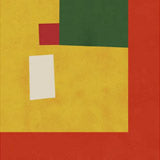
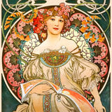
Retrodrome is a UK-based artist working at the intersection of graphic design and fine art. Bold Bauhaus-inspired compositions — coffee houses, vinyl records, wine scenes, vintage festivals — rendered with mid-century colour confidence and clean geometric form. Contemporary illustration that knows its design history.
Retrodrome draws on the visual language of mid-century commercial art — the flat colour planes, the confident geometry, the typography that functions as composition rather than decoration. The subjects range from Bauhaus exhibition posters and vinyl record graphics to wine lodges, coffee houses, and music festivals like Woodstock, all reimagined with a contemporary eye and a designer's precision. The result sits between homage and original work: familiar enough to read immediately, distinctive enough to hold attention over time.
What sets these prints apart is their graphic discipline. Every element earns its place — no decorative filler, no gratuitous texture, no ironic distance. The colour palette references 1950s and 60s print advertising, with warm ochres, deep teals, and burnt oranges that feel both retro and entirely current. The compositions are tight and intentional, the kind of work that looks better the longer you live with it. For more contemporary art prints from artists we work with directly, the collection spans a wide range of styles and approaches.
Choosing the Right Format
The graphic precision of Retrodrome's work comes through best on fine art paper, where clean lines and flat colour fields stay sharp and defined without any surface distraction. Paper prints are available in A3, 50x70cm, 70x100cm, and A0, with framing in oak, black, or walnut brown. Black frames particularly suit the Bauhaus-inspired pieces, providing a contained edge that reinforces the geometric structure of the compositions. Oak framing works well for the warmer, food-and-drink themed prints. Canvas prints in 30x40cm, 50x70cm, and 70x100cm add a subtle surface texture — a good choice for the more illustrative pieces where a slight softness enhances the vintage feel. An optional floating frame gives canvas prints a gallery-quality presentation with a clean shadow gap.
Pairing Retrodrome Prints
These prints work especially well in home offices, kitchens, and living spaces with mid-century or industrial furniture. The graphic confidence reads naturally alongside design objects from the same era — Eames chairs, Danish lighting, terrazzo surfaces, wooden sideboards. For groupings, stay within Retrodrome's own range to maintain visual consistency, or pair with works from our Bauhaus poster collection to create a cohesive design-history wall. Two or three prints in a horizontal line, consistently framed in black, makes a strong statement without overwhelming the room. For kitchen and dining spaces, the coffee house and wine-themed pieces combine well with selections from our kitchen art collection, building a food-and-drink gallery with genuine graphic character.
All prints are produced in our Berlin studio using archival pigment inks rated for 100+ years.


 Woodstock Vintage by RetrodromeFrom €23,99 EUR /
 Bauhaus Musik Vinyl by RetrodromeFrom €23,99 EUR /
 Bauhaus Coffee House by RetrodromeFrom €23,99 EUR /
 Bauhaus Ausstellung 1923 by RetrodromeFrom €23,99 EUR /
 Cavern Club Design Poster by RetrodromeFrom €23,99 EUR /
 Bauhaus Wine Lodge by RetrodromeFrom €23,99 EUR /
 Hacienda Poster by RetrodromeFrom €23,99 EUR /
 Bauhaus Geometric Design Retro by RetrodromeFrom €23,99 EUR /
 Geisha Girl Retro Minimalist Design by RetrodromeFrom €23,99 EUR /
 Montreaux Jazz Festival by RetrodromeFrom €23,99 EUR /
 Snowdrops in Spilled Milk Carton Retro Illustration by RetrodromeFrom €23,99 EUR /
 Campbells Soup Tomato Plant Retro Illustration by RetrodromeFrom €23,99 EUR /
 Bauhaus Ausstellung by RetrodromeFrom €23,99 EUR /
 The Fillmore Poster by RetrodromeFrom €23,99 EUR /
 Marquee Club Retro by RetrodromeFrom €23,99 EUR /
 Geisha Girl 80s Print by RetrodromeFrom €23,99 EUR /
 Crocodile Cafe Retro Poster by RetrodromeFrom €23,99 EUR /
 Viper Room Retro by RetrodromeFrom €23,99 EUR /
 Stonehenge Travel Poster by RetrodromeFrom €23,99 EUR /
 New Forest National Park Travel Poster by RetrodromeFrom €23,99 EUR /
 Lake Windermere Lake District National Park Travel Poster by RetrodromeFrom €23,99 EUR /
 Glacier National Park Travel Poster by RetrodromeFrom €23,99 EUR /
 Cafe Wha Retro Poster by RetrodromeFrom €23,99 EUR /
 Grand Canyon National Park Travel Poster by RetrodromeFrom €23,99 EUR /
 Snowdonia National Park Travel Poster by RetrodromeFrom €23,99 EUR /
 Love Abstract Design by RetrodromeFrom €23,99 EUR /
 Peak District National Park Travel Poster by RetrodromeFrom €23,99 EUR /
 Sequoia National Park Travel Poster by RetrodromeFrom €23,99 EUR /
 Rocky Mountains National Park Travel Poster by RetrodromeFrom €23,99 EUR /